Is Gold in a Bubble? A Practical Look at 2025’s Ratios and Realities

As I have written about before, I’ve been using AllocateSmartly since 2020 to manage a tactical asset allocation (TAA) portfolio built around momentum and trend-based models. Allocatesmartly was introduced to me by Todd Tressider and his coaching platform https://financialmentor.com. TAA is an unemotional system that rotates among asset classes based on what’s working—stocks, bonds, commodities, or cash. It is not much different from what hedge funds do for their high-net-worth clients: trend following. All Allocatesmartly is doing is exposing the public models for the average person who can't access those hedge funds but gets similar performance. Over time, it’s smoothed out returns and kept me disciplined when markets behave irrationally. Here are the last few months, which haven't changed except for last week, it added SPY into the mix for the previous tranche update on Oct. 2nd. Gold has been as high as 40%, and EWJ-Japan has been as high as 15%. For the most part, since about March of 2025, it's been international and heavy gold.
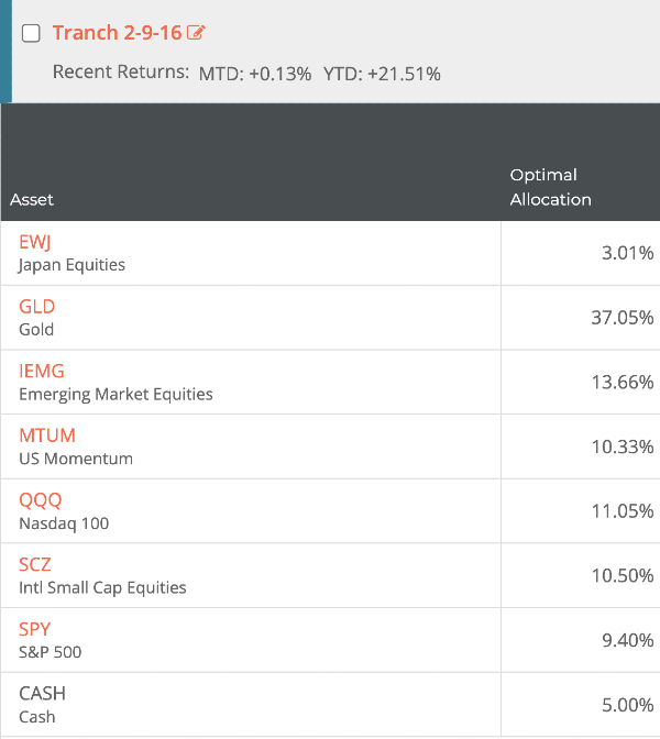
In fact, since early 2024, the models have been trending towards overweight in gold. As you can see above my combined portfolio now holds about 37% in GLD. It’s one of those signals that forces you to stop and ask: is this smart exposure driven by fundamentals — or am I sitting in the middle of a slow-forming bubble?
Gold is unlike stocks or bonds. It doesn’t pay dividends, produce earnings, or generate cash flows. You can’t run a discounted cash flow model to determine fair value. It’s a psychological asset — part inflation hedge, part insurance policy, part speculation. That makes assessing whether it’s “overvalued” more art than science. But we do have ratios and historical benchmarks that tell us when gold has stretched too far beyond its normal relationship with other assets. This is a breakdown of those ratios and what they’re showing in late 2025. Here are a few recent articles but they don't really tell you why or how to decide if its a good asset – they are more speculative or negative on the prospect. So what is the best way to really decide, and how do these experts make a decision, because they are not giving you the whole picture, and TAA uses math, not conjecture or pundit-based decisions, and you shouldn't either.


How to Value Something That Doesn’t Yield
The absence of cash flow doesn’t mean gold is unmeasurable — it just requires a different lens. The best way to gauge its “value” is through comparison: how expensive gold is relative to other major anchors — inflation, interest rates, stocks, and money supply.
In the 1970s and early 1980s, when inflation and geopolitical risk were rampant, gold’s price soared to extremes. After the U.S. left the gold standard in 1971, the metal became a free-floating asset that reflected global anxiety about currency debasement. By January 1980, gold hit $850 per ounce — about $3,590 in today’s dollars when adjusted for inflation (Investopedia).
Fast-forward to 2025. Gold has climbed past $4,000 per ounce (BullionVault), making it not only a new nominal record but also a real, inflation-adjusted high. That alone doesn’t prove it’s a bubble, but it puts us in rare territory. In historical terms, gold is now roughly 12% above its 1980 real peak (InflationData.com).
If we stopped there, the headline would scream “bubble.” But the rest of the data tells a more complicated story.
1. Gold vs. the Stock Market: The Dow/Gold and S&P/Gold Ratios
The Dow/Gold and S&P/Gold ratios are simple yet powerful ways to compare the relative strength of gold to equities. The lower these ratios fall, the more dominant gold becomes relative to the stock market — and historically, those lows have coincided with speculative excess.
In 1980, at gold’s mania peak, the Dow/Gold ratio dropped to nearly 1. The same thing happened, though less dramatically, in 2011 when gold hit $1,900 and the ratio fell to near 6 (LongTermTrends.net).
- S&P500 SPX/Gold(Actual per once) was ~.14 in 1980 and ~.63 in 2011
Today, in October 2025, the Dow/Gold ratio sits around 12.3. The S&P/Gold ratio (or its ETF proxy, SPY($660) divided by GLD($377)) is roughly 1.75. Both are well above the “bubble zone” seen in 1980 or even 2011.
That’s significant. It means that even though gold is expensive in absolute terms, it’s not significantly(extremely) overvalued relative to stocks. U.S. equities have also been in a speculative phase, with valuations that remain near record highs. When two assets are both inflated, their ratio doesn’t necessarily flash a clear warning.
Still, this mid-range reading doesn’t mean gold can’t correct. It just suggests that, for now, gold’s rise is part of a broader re-rating of tangible assets rather than an isolated frenzy.
2. Gold vs. Inflation and Real Yields
Gold’s behavior has always been tied to real interest rates — the return on Treasuries after accounting for inflation. Historically, gold rises when real yields fall (or turn negative) because the opportunity cost of holding a non-yielding asset disappears.
In the chart from LongTermTrends.net, the yellow line represents gold, and the black line represents the inverted real 10-year Treasury yield. Because the yield axis is inverted, when the black line falls, it means real yields are actually rising.
Since 2023, the black line has trended lower — signaling rising real yields — while gold (the yellow line) has moved sharply higher. That divergence breaks the classic inverse correlation between gold and real rates.
The reason is structural, not speculative. Higher nominal yields today don’t reflect improving Treasury “value.” They reflect investor skepticism about long-term U.S. debt sustainability and persistent inflation risk. As yields rise, bond prices fall and the cost of funding federal deficits increases. The Treasury can’t sustain those higher rates indefinitely without pressuring the dollar itself.
Investors see through that contradiction: rising yields signal monetary fragility, not stability. Gold’s surge, even as real yields climb, suggests markets are treating Treasuries as riskier paper — not as a higher-yielding safe haven.
In short, the traditional inverse relationship between gold and yields has flipped because the meaning of “rising yields” has changed. In this cycle, higher yields reflect fiscal stress and currency dilution, both of which strengthen the case for holding gold, not weaken it.
3. Gold vs. Money Supply and Central Bank Behavior
Another way to evaluate gold’s relative “value” is to compare it to global money supply growth (M2 or M3). When money expands faster than GDP, gold tends to catch up. That relationship has started to normalize after years of lag.
Central banks have been a key factor. The World Gold Council reported more than 1,000 metric tons purchased in 2024 and continued accumulation through 2025, with most demand coming from emerging markets like China and India. When reserve holders are buying gold, it strengthens the fundamental case and dampens the argument that the price is purely speculative.
4. GLD Flows and Investor Sentiment
The GLD ETF remains the most visible proxy for investor sentiment. Its assets under management have reached roughly $130 billion, near record highs (SSGA GLD Factsheet).
That sounds frothy, but it’s important to distinguish who is buying. In 2025, participation is coming from institutional reallocations, central banks, and Asian physical demand rather than just retail speculation. It looks defensive, not euphoric.
5. Production Costs and Margins
Mining costs also offer a floor for valuation. The industry’s all-in sustaining costs currently average around $1,300–$1,500 per ounce (Mining.com). With gold near $4,000, margins are at historical highs — but new production cannot ramp quickly due to permitting and geopolitical constraints. That slows any oversupply response.
6. The Geographic Divide: East Buying, West Speculating
Western markets (U.S. and London) have focused on futures and ETFs, while Asian markets are driving the physical trade. Premiums on the Shanghai Gold Exchange have remained elevated, indicating strong real demand. That shift — physical markets leading paper markets — typically signals structural, not speculative, strength (Reuters).
7. The Ratios in Context
| Metric | Current (Oct 2025) | Historical “Bubble” Range | Interpretation |
|---|---|---|---|
| Real Gold Price (CPI-adj.) | $4,040 | ~$3,590 (1980) | Above 1980 real peak → stretched |
| S&P/Gold Ratio | 1.77 | 0.14 (1980) / 0.63 (2011) | Mid-range → not bubble-like |
| Dow/Gold Ratio | 12.3 | ~1 (1980), ~6 (2011) | Not near prior extremes |
| Gold vs Real Yields | Gold rising as real yields rise | Normally inverse (–0.8 corr.) | Historical correlation broken — gold rising despite higher real yields, reflecting fiscal stress and currency risk, not yield strength. |
| GLD AUM | ~$130B | Record (2020–25) | High participation, but driven by institutional and sovereign flows |
| Central Bank Demand | 1,086 t (2024) | Net sellers pre-2010s | Structural demand — monetary diversification, not speculation |
The data paints a nuanced picture: gold is expensive, but not necessarily irrationally so. It’s at record highs, but relative metrics don’t confirm a 1980-style bubble.
What This Might Mean for Investors
If gold were simply repeating the 1980 or 2011 pattern, the ratios would be far lower, sentiment would be euphoric, and the physical market would be detached from fundamentals. That’s not what we’re seeing.
Today’s environment is more complex. The world is simultaneously dealing with high debt, fragmented geopolitics, and uneven inflation. Real interest rates remain unstable. Currencies are competing for credibility, and central banks are diversifying away from the dollar.
Gold is behaving less like a speculative frenzy and more like a repricing of monetary trust. That repricing could continue, especially if currencies face a deflationary shock — a phase where gold typically accelerates even more.
That doesn’t make it safe. Momentum can reverse violently, and stretched real prices rarely stay elevated forever. But it does suggest this isn’t a repeat of 1980’s parabolic blow-off, at least not yet.
Final Thoughts
When I see AllocateSmartly rotating almost 40% of my models into gold, I interpret it less as a market anomaly and more as a message about systemic fragility. Plus, I rarely question the models. I do like diving into the math and reverse engineering how they make decisions. It is why I wrote this article. They make maybe 1-2 key trades per year and the rest are just allocation adjustments for the froth occuring - some models never adjust all year like FinancialMentor's All Weather Quad - it was stuck on 50% GLD /50% SCZ almost all year except for the rare exception when one tranche I had might have swapped SCZ with SPY for a few rotations - its up over 25% on the year. The models are momentum-based — they don’t care about narratives — so when they cluster into one asset, it means the rest of the market isn’t offering real yield or stability.
Gold today is expensive, but so are most financial assets. In a world where debt has no limit and real rates can’t stay positive, the “bubble” might not be in gold at all — it might be in the currencies we use to price it.
That’s the paradox of this cycle: the higher gold climbs, the less certain it is that it’s the problem.
FAQ: Understanding Gold Valuations in 2025
Is gold in a bubble in 2025?
Gold prices have reached record highs both nominally and in real terms. However, key ratios such as Dow/Gold and S&P/Gold remain well above historical bubble zones. The evidence suggests gold is stretched but not in a 1980-style speculative bubble.
What is the Dow-to-Gold ratio and why does it matter?
The Dow/Gold ratio measures how many ounces of gold equal the value of the Dow Jones Industrial Average. It gauges the relative strength between equities and gold. Historically, ratios near 1 indicate gold euphoria, while readings above 10 suggest equities remain dominant.
How do real interest rates affect gold prices?
Gold tends to rise when real (inflation-adjusted) interest rates are negative. Lower or negative real yields reduce the opportunity cost of holding gold, historically producing an inverse correlation around –0.8.
Who is buying gold in 2025?
The strongest buyers are central banks in emerging markets and physical consumers in Asia, particularly China and India. Western investors are participating mostly through ETFs like GLD.
Where can I learn more about tactical allocation models that include gold?
AllocateSmartly (allocatesmartly.com) provides research and model portfolios that dynamically allocate to assets like GLD based on momentum and risk-adjusted returns.
Sources
- AllocateSmartly
- Investopedia – Gold Price History
- InflationData.com – Historical Real Gold Prices
- BullionVault – Real Gold Price Analysis
- World Gold Council – Gold Demand Data
- LongTermTrends – Dow/Gold Ratio
- LongTermTrends – Gold vs Real Yields
- Reuters – China Gold Premiums
- SSGA – SPDR Gold Shares (GLD) Factsheet